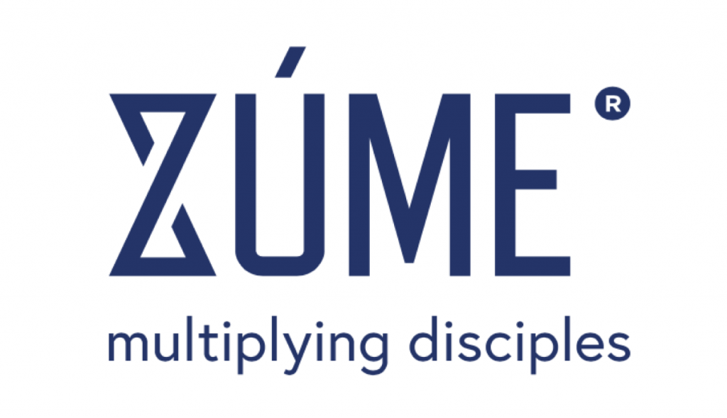
 The Name
Zúme is the Greek word for leaven. It is pronounced as ZOO-may. Jesus used it in His parable of the Kingdom of God in Matthew 13:33 and Luke 13:20-21. He said the Kingdom of God was like a woman who took a little leaven and worked it into a large amount of dough until it was all leavened.
The Zúme project is a simple tool (like leaven) that can be used by ordinary people (like the woman) to work through the entire globe (like the large amount of dough). Like the reproduction of yeast, it follows a natural, organic process of multiplication that is nearly invisible to the eyes but has a powerful, transformative effect.
The “Z”
The stylized “Z” in Zúme has several significances:
- The hourglass shape reminds us of the urgency of the task.
- The “X” in the center is indicative of multiplication.
- The loop formed by the letter symbolizes the infinite.
- The angle of the diagonal stroke is at 115 degrees to symbolize Psalm 115. The entire psalm is relevant, but verse 1 of that Psalm is particularly meaningful, “Not to us, Lord, not to us but to Your Name give glory because of your mercy and faithfulness.” This project is a collaborative Kingdom effort by the entire body of Christ for His glory.
Colors
The colors used in the various logo variations and the website are also significant.
- The dark blue signifies truth and wisdom.
- The light blue signifies faith and hope.
- The green signifies growth and endurance.
Tagline
Multiplying disciples. That’s who we are. That’s what we do.


